


12 Awesome Tips to Improve Your Web Design

Oct 04, 2019
By Bipu Bajgai
So you want to improve your website's design but don’t really know where to start or how to improve it? Well, you’ve come to the right place because we’re going to explore all the top ways to improve your website’s design.
Not all website improvements are created equal though, some things are more critical to get right than others so this blog post is for you if you’re just getting started and want to know the absolute most-important tips to improve your web design and improve your conversion rate.
Before we begin you first need to answer these questions though:
- Can your visitors discover what your company does within the first five seconds of landing on your website?
- Can your visitors easily navigate to the contact page and blog if they desire?
- Is your pricing easy to discover and even easier to understand?
- Is your navigation obvious and easy for people to use?
- Is your bounce rate low and your pages per session healthy and high?
If you answered no to any of the above questions then it is fair to conclude that perhaps your web design is sub-par (at best) and could do with a little (lot) of tweaking. But don’t feel bad, many of us get web design wrong, and I can guarantee yours is not the worst! Plus, the first step to improvement is awareness, and now that you know there’s room for improvement, finally you can do something about it.
So now that we know there’s work to be done, what shall you do first to improve your web design? Here are our top 12 web design tips.
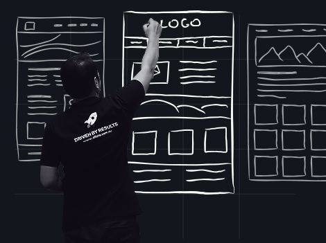
 A website isn’t just design
A website is more than the way it ‘looks’. In fact, great web design considers the entire user experience on the website. Your website design should also focus on the content, functionality, messaging, structure, and navigation.
When you’re assessing your website, try to compartmentalise web design into these key areas and then assess what needs to be done. The ‘feel’ or ‘look’ of a website is not all there is to good design.
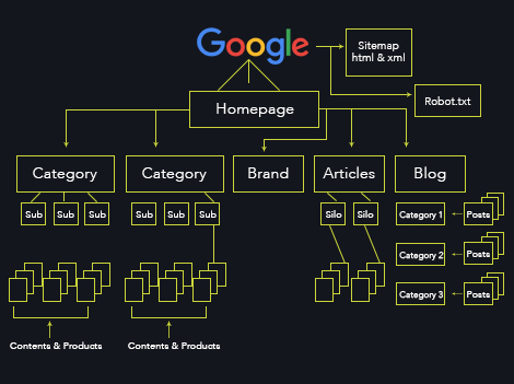 Create a clear site map
Don’t cowboy your design process. Winging it is not how businesses grow online. Before you do anything make a list of the most important pages and subpages that should be on your site. Then create a clear site structure and navigation for every one of those pages to ensure that no pages become ‘orphaned’ and that your every page on your website has been considered.
One way to create a clear site structure is by mapping out your ideal customer journey. Think about the experience you want them to have from start to finish. Then build on that.
Consider:
- Where they’ll start
- What information they’ll need
- What pages they will view
- What action they should take
By creating a clear site structure and customer journey you will be able to effectively usher your customers through a very specific and clear nurturing funnel.
 Remove the unnecessary or overly common
Although we’re focusing on elements that we should include in our web design, we can’t dismiss the elements that we should in fact avoid. The fact is that poor web design often distracts the visitor from the overall goal or message your business is attempting to communicate.
Some of those things include run of the mill stock photography, complicated or messy animations, pointless videos, long but unhelpful and unnecessary content, mixed calls-to-action, clutter, too many messages on the one page.
These days our attention span as consumers is limited and knowing this it’s important we create an easy to digest and easy to remember message.
Think short, succinct, clear and powerful blocks with well-spaced images, headers and CTA’s.
Anything that’s ordinary, obvious or overused should be eliminated.
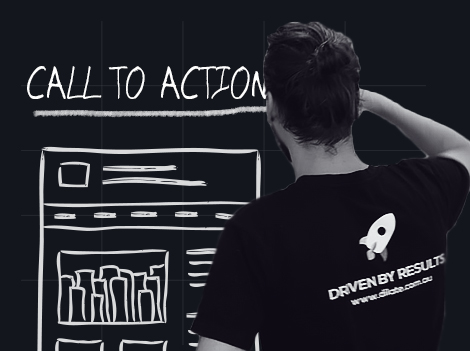 Consistent & clear calls-to-action
So far you’ve ticked all the boxes and managed to get traffic to your site? Now what? Is the next step obvious to them? If not it could be because you don’t have enough CTA’s or too many mixed messages.
A rule of thumb is that within any section a visitor is scrolling over, there should be an obvious action for them to take, and within any single page a visitor is on, it should be the same CTA throughout that page.
It’s also important to think about the most appropriate CTA for that specific page. If a visitor is just hitting the homepage for the first time, then perhaps “BUY NOW” isn’t the most tactical CTA to have above the fold.
 Integrate social share icons
It’s textbook, but to serve as a reminder in case you haven’t yet done this. You should be creating ample opportunities for your users to share the content you’re creating on your website. Pinterest, Facebook, Instagram should all be easily shared directly from your website to your visitor's social accounts.
Tools like SumoMe or Shareaholic are a really great place to start if you’re trying to encourage more social shares.
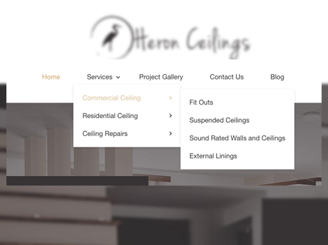 Consider navigation
Navigation is web design 101 and it should include all the core areas of your website that visitors need access to most regularly.
Have you ever been on a website that doesn’t have an obvious navigation bar or a very basic one that doesn’t include the page you’re looking for? You generally leave straight away, don’t you?
Take a look at your current website navigation and ask yourself are all the important pages clearly visible? Will my visitors be able to find all the information they’ll be looking for?
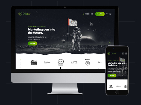
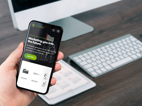 Build for mobile
Optimising for mobile is another web design 101 rule. Especially in 2019 with more than 80% of internet users searching via their mobile.
40% of users have also said they would instantly go to a competitors site of a website they visited on their mobile was slow, clunky or difficult to manage.
Always check your mobile responsiveness and if it’s not 100% perfect, you must optimise it!
You should be aiming for a completely seamless mobile experience.
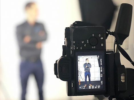 Invest in high-quality content creation
There are some really good stock photography websites out there, and yes we use them on occasion because we don’t always have time to take the right photos for what we need when we need it.
BUT
No stock photography website will ever beat original, high-quality content creation taken specifically for your website. If you want to create a unique website experience that truly reflects your brand and provides your users content that hasn’t been seen anywhere else on the internet, investing in high-grade photographers is an absolute must.
 Keep it clean
Rule number 9 of web design? Don’t be afraid of white space and minimal design.
White space, aka negative space, is one of the most common design elements used by professional web designers.
White space is awesome at breaking up the information on the page and making the reading experience easier for the visitor.
 Invest in SEO
If a tree falls in the woods but no one was there to hear it, did it ever make a sound? The same can be said for your website.
If your website isn’t optimised for discoverability it’s essentially the same as not having a website at all.
If you really want to make the most of the online world, then you need to create a website that GETS. YOU. FOUND.
How do you do that? You invest in professional SEO specialists who develop a clear SEO strategy based around qualified keywords and search terms relevant to your business.
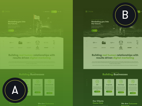
 Build a home page as a stand-alone landing page.
There’s a new way of building your home page in 2019, and it’s banishing the outdated ‘above the fold’ rule that everyone has been harping on about the last few years. You should try to approach your home page design as you would a landing page. Something that offers a holistic and clear view of your entire business and what you do. Why make people move to a second page if they can accomplish everything on the home page?
There’s so much you could include on your homepage, but for now, we’ll just limit it to 10 things that are proven to increase conversion.
- Introductory/Brand Awareness Video
- Clear header summarising who you are
- Clear Value proposition and unique differentiator
- Overview of services and product features
- About Us/Meet the Team
- Case Studies
- Resources
- Testimonials
- Call-to-actions
- Contact Us
Update content constantly and test continuously
Don’t rest on your laurels, they’re not a good place to rest. Complacency is a real killer in an innovative space like online marketing. You need to remain fresh, current and on-trend. It’s important to create copy that not only impresses and engages your visitors today but will continue to do so next month and next year.
So how do you do that? You need to continuously revise and re-do. One way to ensure you’re always updating is to schedule in quarterly content reviews in your calendar, you’ll be surprised by the number of things that you find can become outdated within a matter of three months.
Additionally, it’s important to continually test - even when your website is, by your standards, performing well.
It could always perform better because the truth is that there will never be a perfectly optimised website. By analysing things like heatmaps, conversion paths, pages per session, heavy bounce rate pages, popular CTA’s we can improve the functionality and conversion rate of your site.
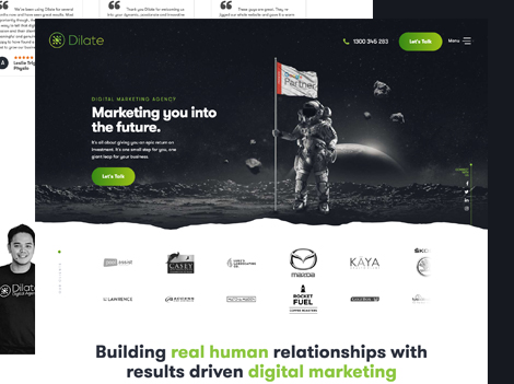
Dilate Digital are web design specialists that work in an intimate capacity with you to create the website of your business dreams. As a full-service agency, we also possess the skills to create killer content, a conversion rate optimised layout and user experience that’s truly a game-changer for your businesses online presence. We create with SEO in mind and set you up with the best chance to achieve search engine visibility.
If you’d like to discuss your business needs with us, give us a call today and let’s start a conversation.


