

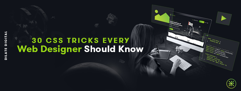
30 CSS Tricks Every Web Designer Should Know

Feb 18, 2020
By Brendon Crouch
Wondering how to up your CSS game? Our team of web designers in Perth have come up with 30 of the latest CSS tricks every web designer should know how to use. CSS can be complicated, but once you get your head around some of the essential tricks, you can use them to achieve some amazing results.
What are the advantages of CSS?
Have you ever caught yourself wondering “how is CSS used to style that?!” It seems like there’s no end of ‘ah-ha’ moments with CSS, as it can achieve everything from creating cool visual effects like gradients to custom text shapes and drop caps.
Once you get a good handle of the basics of CSS, there is no end to what you can achieve. Check out our tips and tricks below to see how you can use CSS creatively to wow your website users.
1. Asterisk ( * )
The asterisk is a time-saver. It allows you to apply styles every time a specific tag is used so that you don’t have to type it out manually.
When you use the asterisk with a selector, you are essentially saying “select all elements of this selector”. From there you can apply particular CSS styles across all the elements, every time they appear.
For example, let’s say I wanted all elements inside <div> to have the background colour of pink. I simply use the asterisk to select all the elements, and then apply my styling.
div * { background-color: pink; }
2. Controlling the elements of a section
If you want to control the elements of one section of your website, you can do so with class selectors. Let’s say you want to add a specific styling to all the images in your blog. You can do so by combining the class .blog and the selector img. This will select all the images in the blog section, and not any other images in other sections of your website like your logo or icons.
Here’s how we would add a blue border to all images in the blog section:
.blog img { border: blue solid 2px; }
3. Select Direct Children & Specific Child Elements
Here’s another time-saver. Using > will allow you to select the direct children of an element.
Let’s say you want to style every <p> element that has a <div> parent. You don’t want to select any other elements in the <div>, just the direct child <p>.
To do this you use: parent > child you want to select, and then add your styling. For example, if I want to make the background pink for every <p> element whose parent is a <div> element, I’d use the following:
div > p { background-color: pink; }
Let’s say you now want to select and style specific child elements. Well, there’s a way to do that quickly and simply too. For example, if you have a list and you want to apply styling to the second item in the list, you’d use the following CSS:
ul > li:nth-child(1) { background-color: pink; }
‘nth-child(2)’ means the third item will be selected. But what if you wanted to apply the styling to every second item instead of just once off? The trick is to put ‘nth-child(2n)’. The 2n will target every second item. Or 3n will target every third item and so on. The CSS for this trick is:
ul > li:nth-child(2n) { background-color: pink; }
4. Apply CSS to multiple selectors
If you are wanting to add the same styling to more than one selector, don’t write it out for every selector. Shortcut and list your selectors out before writing the styling just once.
For example, let’s say I want to make three different selectors orange, I don’t need to write the CSS out three times. Instead I would list the selectors and write the CSS out once:
			a,
			p.orange-text,
			div > p.special
			{ color: orange; }
5. Absolute Positioning
Absolute positioning will help you control exactly where an element is on a website at all times. This can help solve the problem of when the position of an image or block looks different on a mobile device versus a desktop.
Using absolute positioning, you can control where you want an element by specifying how many pixels top, bottom, left and right you want it to be. Absolute positioning can also be used inside of a div.
			h2  {
				position: absolute;
				top: 30px;
				right: 50px;
			}
The CSS above demonstrates how you would make an <h2> element stay 30px from the top, and 50px from the right edge of your browser.
6. Sticky Elements
Another useful CSS position is ‘Sticky’. You would use this when you want an element to keep its position when you scroll to a certain point. The element will act like it’s relative-positioned until it reaches a specific point. Then it will start acting like it’s statically-positioned.
For example, let’s say you have a table on your web page. Initially you want the table to stay relative to the other elements on the page. But when the user scrolls down, you might want the column headings to stick to the top of the page as they scroll. That’s what position sticky is for. Keep in mind though, position: sticky; still has limited browser support.
Here’s an example:
			div.sticky-logo  {
				position: -webkit-sticky; /* Safari */
				position: sticky;
				top: 10px;
				left: 10px;
			}
7. Resizing Images
If you need images to stay below a certain size, you can use max-width to control the maximum width that an image can be. You can either define this maximum width in pixels or use a percentage.
			img  {
				max-width: 100%;
				height: auto;
			}
In the example above, the maximum width for the image has been set to 100%. The image will now not exceed the width of the containing block. The height has been set to auto, which means the height of the image will be automatically calculated based on what the width is. This is a useful way to keep your image proportionally correct.
8. Centering Content
Sometimes you’ll want to centre a block or image so that the left and right margins are the same. To do this, you use auto margins. Usually you’d use this when the block or image has a fixed width because if the block is flexible, it will take up 100% of the available width.
Let’s say I have an image I want to centre. First, make the image its own block, and then auto the margins.
			img  {
				display: block;
				width: 60%;
				height: auto;
				margin: 0 auto;
			}
Note, the width is less than 100%. If 100%, the image wouldn’t need centering because it would be full width.
9. Centering Text
If you want to centre lines of text in a paragraph or heading, simply use ‘text-align’. For example, to centre the lines in a paragraph you would use:
			p  {
				text-align: center;
			}
On the other hand, if you want to align text to the side, simply put ‘left’ or ‘right’ in place of ‘center’.
10. Vertical Text Alignment
If you want to align one line of text vertically, there are a few methods:
- Line-height
Use a line height value that is equal to the height value.
			.center  {
				line-height: 200px;
				height: 200px;
				text-align: center;
			}
- Padding
Simply use top and bottom padding to centre the line of text vertically.
			.center  {
				padding-top: 200px;
				padding-bottom: 200px;
			}
- Position & Transform
If you can’t use the line-height or padding techniques, try using position and transform.
			.center  {
				height: 200px;
				position: relative;
			}

			.center p  {
				position: absolute;
				top: 50%;
				left: 50%;
				transform: translate(-50%, -50%);
			}
11. Custom Text Shapes
Sick of text always having to be in a rectangular box? You can use CSS to create more interesting layouts that aren’t contained to a rectangular shape. Changing up layouts and making room for more organic shapes is one of the current popular trends in website design.
Using the .shape-outside property you can wrap your content according to custom paths. For example, if you want to make your text wrap around a circle shape, use shape-outside and define the float property and dimensions of the element.
			.element  {
				shape-outside: circle(50%);
			}
12. Vertical Screen Height
What happens if you need to fill the whole screen (whether mobile or desktop) with something? Easy. Just use view height (vh) to control how much of the screen is taken up by an element.
If you want the element to fill the whole screen, use 100vh. If you want it to fill less, replace 100 with the percentage of the screen you want filled. E.g. use 50vh if you want it to take up half the screen.
			.element  {
				height: 50vh;
			}
Just beware that you might need to play with the value for different screens or phone orientations. You don’t want to end up stretching a landscape image to fit a vertical phone screen!
13. Drop Caps
Have you ever wanted to start a page of content off with an old school drop caps? Now you can. Drop caps makes the first letter of a paragraph nice and big, and is a great way to grab attention.
An easy way to create drop caps in CSS is by using :first letter to set the size of the first letter relative to the other letters in the paragraph. The example below shows how I would make my first letter 4 times as big as the other letters (font-size: 400%). I can also control the colour and how much space I want around the letter.
			p::first-letter  {
				font-size: 400%;
			}
14. Capitalising Headings
How annoying would it be if you typed something out in all caps, only to be told later that it needs to be in lowercase? Thankfully there’s an easy way to format capitalisation. Use the following CSS styles:
- For all caps use {text-transformation: uppercase;}
- For all lowercase use {text-transformation: lowercase;}
- To capitalise the first letter of each word use {text-transformation: capitalize;}
15.Smart Quotes
Alright, so you probably know there’s HTML for quoting. Using the <q> tag will help you with inline quotations and take care of inner quotes. But what can CSS do?
With CSS, you can customise to get the look you want. For example, if you want to create more than one level of nested quotes. Like this:
“This is the main quote, ‘this is the nested quote.’”
			q  {
				quotes: "\201C" "\201D" "\2018" "\2019";
			}
Or you could do this:
«Change up your quotation symbols.»
			q  {
				quotes: "«" "»";
			}
16. CSS reset
A CSS reset can be used to reset all styling so that you have consistency across different browsers. Each browser has their own style sheet, with in built default styles, and this can sometimes be a problem when you’re trying to make your website look consistent on all browsers.
A CSS reset is one method that can help give you a standard base across the board. It will help remove borders, preset margins, line heights, padding etc. From there, you can restyle your document. There are different CSS resets available (this one from Eric Meyer is good), but they should be tweaked to fit your situation best before using.
			/* example of a minimal reset CSS */

			html  {
				box-sizing: border-box;
				font-size: 16px;
			}

			*, *:before, *:after  {
				box-sizing: inherit;
			}

			body, h1, h2, h3, h4, h5, h6, p, ol, ul  {
				margin: 0;
				padding: 0;
				font-weight: normal;
			}

			ol, ul  {
				list-style: none;
			}

			img  {
				max-width: 100%;
				height: auto;
			}
17. !important
!important is a powerful CSS tool that should be used sparingly because if you use it all the time, it could make things messy later on. However, there could be some circumstances where you would benefit from using !important to override existing styles.
Placing !important after a style in your CSS will override any other styling for that element. Using it will basically say “this is important, ignore all other styling!”. For example, if your h2 headers are currently black, but you want to make them orange in a particular document, you can use !important to override the black.
			.home-page h2  {
				color: orange !important;
			}
18. :before
:before is used when you want to have specific content appear in front of a certain element every time that element occurs. For example, let’s say I wanted the words “Check this out - ” before any h2 tag on my website. I would use the following:
			h2:before  {
				content: 'Check this out - ';
			}
19. :after
:after is similar to :before, except that you use it to make content appear after specific elements every time they appear. A very common way to use :after is by adding the text “read more” every time you have a blog excerpt on your website. See the example below for how you would do that.
			p.blog-excerpt:after  {
				content: 'Read more';
			}
20. Content
The CSS property of content is used with the :before and :after selectors to insert content. Content can be a String, Counter, Image or Attribute.You can achieve so many awesome CSS tricks with the content property, but let’s just do one example so you get an idea.
If you have links to documents on your website, you might want to let your website visitors know what type of document it is. E.g. a PDF a DOC. Using content:url() will show a little image to indicate what kind of document the link is.
			a.pdf_links:after  {
				content: url(pdf_icon.png);
				height: 50px;
				width: 50px;
			}

			a.jpg_links:after  {
				content: url(img_icon.png);
				height: 50px;
				width: 50px;
			}
21. Box-sizing: border-box;
Got issues with sizing your boxes? It can be very frustrating when you create a box of a certain width, add padding, and then your box gets bigger. The trick to keeping your box the size you want it to be is box-sizing: border-box; This trick is easy, but very helpful for keeping boxes the size you want.
By default, the actual dimensions of an element are calculated by adding padding and border to the specified height and width. That means two boxes with the same specified height might appear different sizes if one has padding specified.
BOX 1
BOX 2
That’s where box-sizing comes in. Using box-sizing: border-box; will make the padding and border included in the specified width and height. So you see, this solves the problem and keeps the box the size you want.
			.box1-green  {
				box-sizing: border-box;
				padding: 20px;
				height: 100px;
				background: green;
			}

			.box2-blue  {
				box-sizing: content-box; /* default value */
				padding: 20px;
				height: 100px;
				background: blue;
			}
22. Hover Effect
Sometimes you might want buttons, text links or icons to change colour when someone hovers their mouse over them. To create this hover effect, add :hover and change the colour styling to the original CSS.
			h2  {
				color: black;
			}

			h2:hover  {
				color: orange;
			}
In this example, your h2 tag will change from black to orange when someone hovers their mouse over it. If the only thing you want to change is the colour, you don’t need to specify the font size or font weight again.
23. :link and :visited
A good way to make it easier for visitors to navigate a website is to let them know what they’ve already clicked on. For example, links that they’ve already visited might be styled a different colour than links they’ve yet to click on.
To do this, you can use :link to control all the links that haven’t been clicked on yet, and :visited to control the styling of those that have been clicked on. For example, if I wanted my unclicked links to be blue and my clicked links to be red, this is what I’d do:
			a:link  {
				color: blue;
			}

			a:visited  {
				color: red;
			}
24. Mandatory fields in a form
If your website has a form, you probably want some of the fields to be mandatory. For example ‘Name’ or ‘Email’. You’ll need to let your website users know which fields are mandatory, and which are not. You can do this with a cool CSS trick that uses the :required and :optional pseudo classes.
Using :required will select all the mandatory form elements, whereas using :optional will select all the elements that aren’t mandatory. For example, if you want to visually signal that a form element is required, you might select the required elements and make the background red for these.
			input:required,
			textarea:required,
			select:required  {
				background-color: red;
			}
25. Clipping
If you have an image, but you want it to appear in a particular shape, you can use clipping. You can think of clipping like cutting a piece of paper into the shape you want - circle, star, diamond etc. By creating a clip-path, you are defining which area of the image is visible. Everything outside the clip-path will be hidden from sight.
Let’s say I have a headshot of a team member, but I want the image to show up as a circle instead of its natural rectangular shape. One way of doing this would be:
			img.team-member  {
				clip-path: circle(60px at center);
			}
26. Linear Gradients
Wanting to spice up a plain one-colour background? CSS gradients are an easy but eye-catching way to do so. With this trick, you can make gradients of two or more colours.
Linear gradients go from top to bottom, left to right or diagonally. To create this effect you need to define two or more colour stops. The other aspect you can play with is where the gradient starts from and what direction it goes. If you don’t specify this, the default direction is top to bottom.
Let’s say I want to make a diagonal gradient from blue to purple that starts at the top left corner, and goes to the bottom right. This is how I’d do that:
			div.gradient  {
				background-image: linear-gradient(to bottom right, blue, purple);
			}
27. Radial Gradients
You’ve got the linear gradient down pact, now it’s time for a radial gradient. This type lets you create a gradient that radiates out from the centre. You can play with the spacing of the colour stops, and get really specky by using the repeating radial gradient.
Here’s the most basic example using three colour stops of yellow, orange, red.
			div.radial-gradient  {
				background-image: radial-gradient(yellow, orange, red);
			}
Now let’s create that hypnotic repeating radial gradient.
			div.radial-gradient  {
				background-image: repeating-radial-gradient(red, yellow 10%, green 15%);
			}
28. Using gradients on text
Can we take the gradients one step further? How about making it show up on text instead of a background? Let’s say we have some h1 text, and want to overlay a red to yellow linear gradient on it. The trick is to use Webkit specific properties and CSS gradients (linear or radial).
			h1  {
				font-size: 96px;
				background: -webkit-linear-gradient(#35CBAE, #E82962);
				-webkit-background-clip: text;
				-webkit-text-fill-color: transparent;
			}
29. Create a Duotone Effect
A pretty cool trick you can do with CSS is turning your images into two tones. This is a great way to make your look consistent across the website, and it’s pretty hot right now.
CSS blend modes are easy, and only require you to change the colour value in CSS. There are 15 blend modes in total, some of the most popular are overlay, screen, darken and lighten.
To achieve a duotone look on a single <div/>, add a :before with the colour you want for the highlights, and use the darken blend mode. Then add an :after with the colour you want for the shadows, with the lighten blend mode. Voila.
			.duotone  {
				background: url('https://jazz.fm/app/uploads/December52011/Jimi-Hendrix.jpg') no-repeat center center fixed;
				background-size: cover;
				width: 500px;
				height: 350px;
			}

 			.duotone::before  {
 				background-color: #ddd10a;
 				content: '';
 				display: block;
 				width: 500px;
 				height: 350px;
 				mix-blend-mode: darken;
 				position: absolute;
 				top: 0;
 				left: 0;
 			}

 			.duotone::after  {
 				background-color: #c53030;
 				content: '';
 				display: block;
 				width: 500px;
 				height: 350px;
 				mix-blend-mode: lighten;
 				position: absolute;
 				top: 0;
 				left: 0;
			}
30. Circular Menu
Sometimes the standard dropdown menus don’t translate well to mobile devices. Circular menus offer an alternative. They basically make icons jump out of a circular arc, and are pretty effective across nearly every interface.
You can achieve a great circle menu using just CSS. Here's a great example.


