


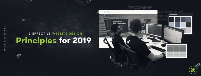
13 Effective Website Design Principles for 2019

Sep 13, 2019
By Bipu Bajgai
There are so many elements to alluring web design that should be considered during the design process. Not to put a downer on your day but if you’ve spent thousands of dollars curating the most beautiful website for your business but it hasn’t been effectively designed with the user in mind, it will have been all for nothing. #sorry
Frank Chimero once said that “people ignore design that ignores people”, and your website is the perfect example of this. It needs to have user experience at the forefront of design. Don’t get me wrong, you need to consider aesthetics, but you also need to consider form, function and psychology too.
For all the folks out there who’ve already spent the big bucks on their website, don’t despair - there are small tweaks you can make below to drastically increase your user experience. If you haven’t yet embarked on the joyous journey of web design for your business, buckle up - we’re about to go for a fun ride into the human mind.
How to tell if your current website needs a bit of a user experience face lift?
Using sites like Google Analytics and Hotjar will give you great insight into website behaviour. Websites with poor design elements and user experience have similarly poor GA (Google Analytics) metrics. What you need to be looking for are high bounce rates, minimal time on site, low pages per session, conversion rate and so on.
So what does it take to create an unforgettable user experience? Here are our top 13 effective web design principles for your 2019 website build.
1. Know your Purpose
 Let’s start with the basics here. Why are you building a website; what are your goals? Effective website design strategy always caters to the needs of the user and the reason for them being on your website.
What are they looking for? Information, interaction, entertainment, or a purchase? Understand the purpose of each individual page, and the specific need it should fulfil.
If you already have a website, conduct an audit. Ask yourself the following:
- Does every page have a purpose and goal?
- Is the purpose and goal journey clear?
- Are there any unnecessary pages that could be removed altogether?
- Is the user journey clear and logical?
Get back to basics and understand the main goals for your website and then start building to fulfil those goals.
2. Consider Communication & Messaging
 It’s 2019, people expect information online to be presented quickly, and succinctly. People don’t have time to waste, and you need to respect that value by ensuring that your web copy and communication style is clear, easy to digest, and even easier to find.
Some simple web design principles to ensure you communicate effectively are:
- Implement headers and subheaders
- Keep your paragraphs short and your sentences shorter
- Use bullet points and have an “anti ramble” policy
- Implement a search bar on your website
One of the top reasons web users report bouncing from a page quickly is due to unclear or lengthy web copy that doesn’t serve the users need. Mitigate your high bounce rates by paying for better web copy.
3. Understand Typeface Psychology
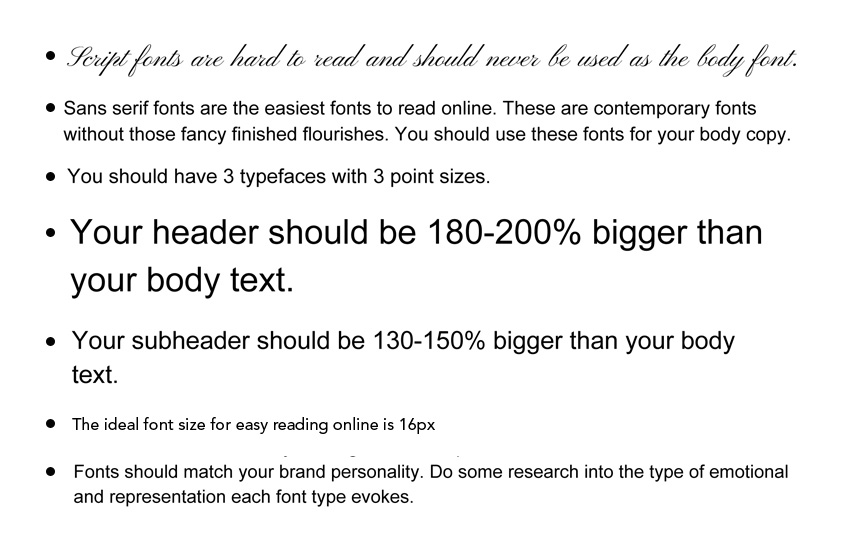
Yes, there’s psychology for a typeface. There’s psychology for everything these days. The general rule of thumb to ensure your typography presents an easy user experience is as follows.
- Script fonts are hard to read and should never be used as the body font.
- Sans serif fonts are the easiest fonts to read online. These are contemporary fonts without those fancy finished flourishes. You should use these fonts for your body copy.
- You should have 3 typefaces with 3 point sizes.
- Your header should be 180-200% bigger than your body text.
- Your subheader should be 130-150% bigger than your body text.
- The ideal font size for easy reading online is 16px
- Fonts should match your brand personality. Do some research into the type of emotional and representation each font type evokes.
4. Colour Palette Curation
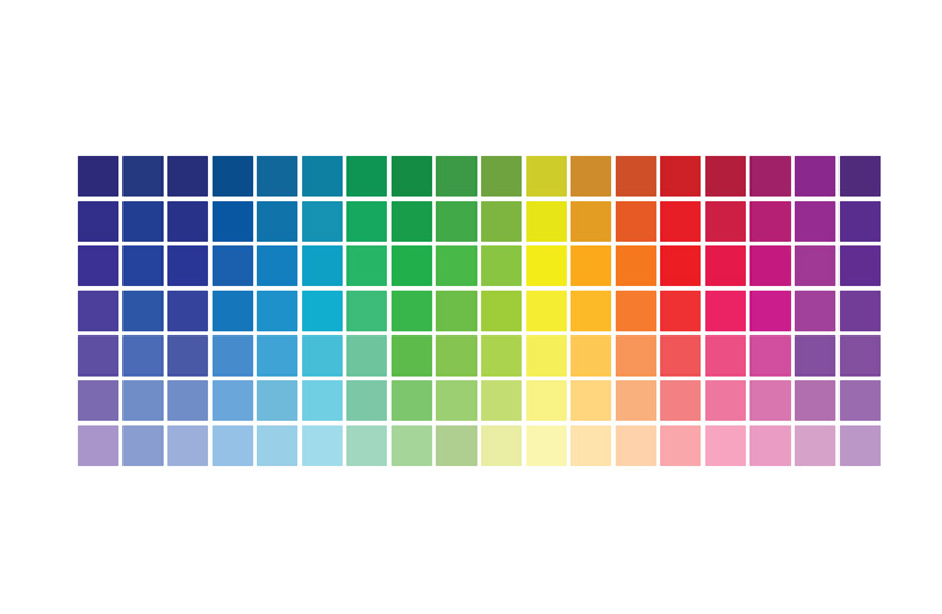
A well-aligned colour palette does wonders for your website in regards to improving your user experience. Why? Effective colour palettes complement each other, your brand and provide logical visual cues. What this means for your website is that you’re creating balance, consistency and a logical journey for the user. A few benefits of an effective colour palette include:
- Using contrasting colours between the text and background improves readability.
- Particular colours evoke particular emotions and colour association teaches users how to navigate through your website. For example, using a specific colour sparingly and only for CTA’s lets users know that they need to take action.
White space (aka negative space) reduces clutter, making your website appear more simple and less overwhelming for the user.
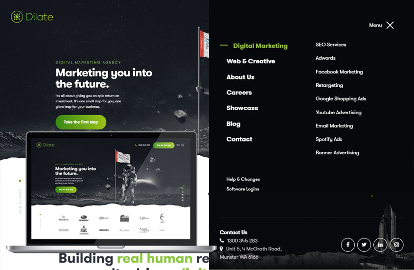
5. Imagery Use

Images are one of the most simple and obvious ways to get your user experience right online. Choosing ‘on brand’, high quality, engaging images that connect with your target audience is one of the essential web design tactics we use here at Dilate. It’s simple, effective and so easy to get right.
On the flip side, however, getting your imagery wrong has a damaging and adverse effect. Putting images on your site that are low quality, un-engaging and irrelevant can make you lose potential customers forever. It’s never been easier to build a business online which is great, but it’s also made the barrier to entry low, meaning there is more competition than ever. A simple, careless mistake like poor imagery choice could be the make or break of your online business.
Another effective use of imagery is to insert easy to digest infographics and videos where appropriate as these types of imagery communicate more quickly and effectively than text or image alone.
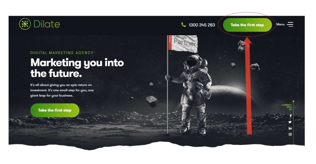
6. Navigation is Key
Navigation is ESSENTIAL for user experience. In fact, one of the main reasons people don’t stick around on site is because the navigation was illogical, incorrect or too confusing.
The main aim of navigation is to make it simple and OBVIOUS for your users to move around your site and take action. Effective web design takes this navigation element into account and uses it to ensure streamlined user experience.
Some ways to do this include:
- Logical Page Hierarchy
- Using breadcrumbs to make it easy to go back a step
- Implementing more clickable buttons where appropriate
- Abiding by the 3-click-rule. This is essentially the notion that all customers will have found the information they were seeking within three clicks on your website.
7. Measured Layout Designs
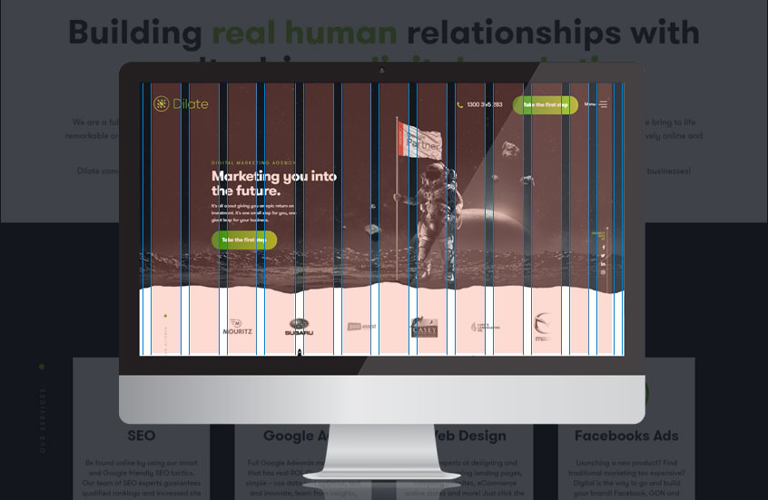 Your web pages should be designed intentionally. Many web designers work from a grid-based layout. These layouts help create structure, spacing and logical user journeys. They do this by arranging your page content into sections, distinct columns and boxes that all lineup and feel balanced, giving your website a more structured and orderly feel.
Placing content on your web page without a plan in mind often gives your website a messy and unorderly feel.
8. Remember the ‘F’ Pattern Design Element
 What is the ‘F Pattern’? It’s the understanding that the majority of people scan their computer screens in an ‘F’-like pattern. This has actually been tracked and studied. So this is based on fact, and as web designers and developers we use this to our advantage.
Knowing that users scan screens in this pattern in order to gain the information we can arrange our most important information with that pattern in mind. Since we know that most people only see the top and left of the screen, we know that the bulk of our information should be dividing within these areas. Similarly, we also know that the right side of the screen is rarely seen, so rather than trying to force an unnatural visual flow, we can work with a reader's natural behaviour and avoid putting information in the places they simply won’t look. Like the lonely little right side of the screen.
It’s also probably good to note here, that this is a study based on Western Culture where people are taught to read left to right, top to bottom. Trying to use this pattern in countries such as Egypt, United Arab Emirates or Iran where Arabic is their dominant language probably won’t fair so well.
9. Don’t Forget Your Load Time
 This is a very simple lesson, and I’ll teach it with a question. Think back to the last time you found yourself on a site that didn’t load instantly. Now tell me, what did you do? Did you wait patiently, or did you jump ship after 5 seconds?
I rest my case.
If you have a website that loads within 5 seconds, statistically speaking your average stay per session is 70% higher than everyone else. On the other hand, however, if you have a website that has slow load page performance, 79% of people are most likely to leave your site and not visit it again. Yes, you read that right: they WON’T VISIT YOUR SITE AGAIN! That’s how sensitive people are these days about their time being wasted. One micro delay and you’re their sworn enemy for life.
Now think about the fact that nearly 80% of internet users are like that. If you do have a slow load time, think about the fact that you’re consistently losing 80% of potential customers every day that probably won’t visit you again. Effective web design practise accounts for slow load times and implement a few tricks to help mitigate the load time delay.
Some of those tips include:
- Optimising/compressing image sizes
- Combining code into a central CSS or Javascript file
- Minimising HTML, CSS & Javascript by compressing them
- The above tactics can drastically speed up your load time and keep users coming back again and again.
10. Is Your Website Mobile friendly?
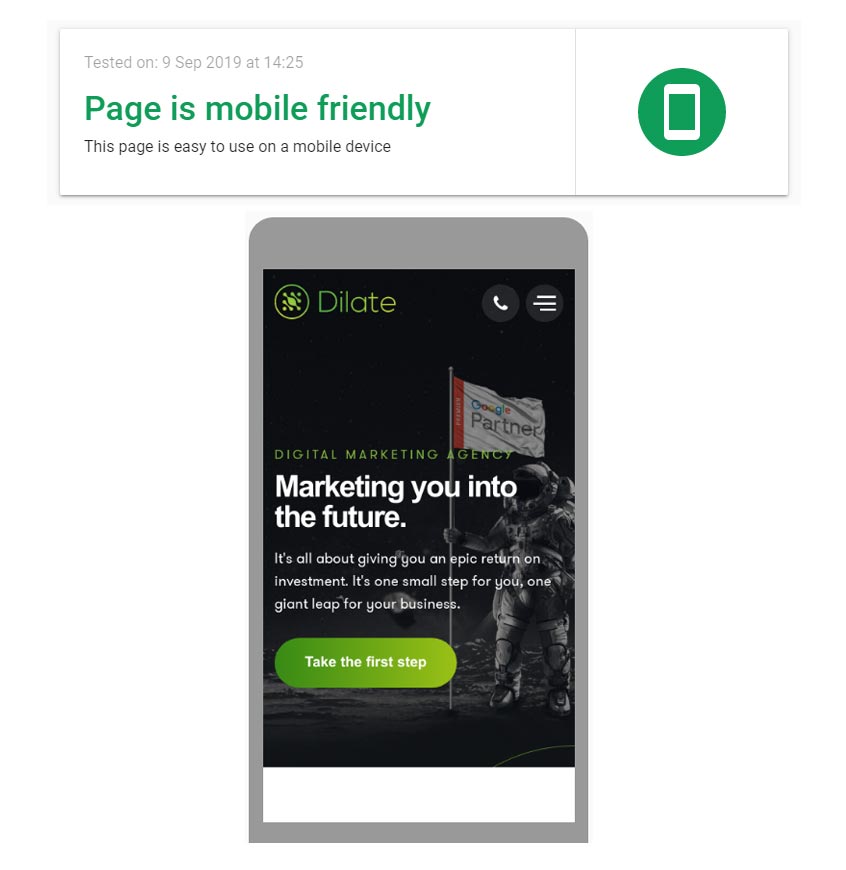 Welcome to the mobile age, the age of business on location, tweeting from the air, shopping from your bedroom, streaming on the bus or train. We’re living in a half digital world, and it’s absolutely vital you and your business get on trend.
Being able to access websites from any device, at any time, in any location is the new normal and it’s important you consider this element in your website design. If you were a customer on your mobile website, would you enjoy your experience? Or would you bounce?
If your website is, in fact, a little less than desirable on mobile you have two choices. One, you can rebuild it in a responsive layout - meaning your website will adjust to all the different screen widths. Two, you can build a dedicated mobile site (a separate optimised site specifically for those on their mobiles).
There are only these two choices, everything else is giving your customers to competitors.
11. Pay Attention to the Visual Heirarchy
 Visual hierarchy is one of the most fundamental principles of effective web design.
The concept? Whatever stands out gets the attention.
- A tall person in a group of small people
- A pop of colour amidst a block
- That one squeaky door in your house that needs grease
In web design, the same rules apply, any visuals that stand out, garner the most attention. This is the natural human behaviour - and it stipulates the order in which the human eye perceives what it sees.
Applying this behaviour pattern and implementing it on your website is a trick web designers use to draw attention to the important things first such as USP’s, CTA’s, Forms and Buy Now Buttons.
You can draw attention to the most important aspects of every page by altering:
- Size
- Colour
- Space
- Typography
- Patterns
- Contrast
- Proximity
- Alignment
- Negative Space
- Implementing the Rule of Thirds
- Altering the perspective
12. Then there’s Hick’s Law

Hicks Law is all about decision paralysis. It states that with every additional choice a user has to make increases the time required to make a decision and can hinder people taking an action. Perhaps the most accurate example of this is at the shops. Picture it: you’re standing in the ice cream aisle, in front of 100 different brands, sizes, types and prices of ice cream.
The anxiety sets in, “I want so many, they all look so good though! Which one do I want? The Snickers Ice creams are delicious, but oh wait! The Picnics are on special! And so is the Pana Chocolate. I’ve really been wanting to try Connoiseurs New Salted Caramel and toffee.”
Then what happens most often? “Ahhh, it, I’ll just go back to the trusty old Magnum’s I always get.” Choice paralysis hinders progress, it hinders people taking action, there’s so much on offer it becomes too much of an effort to sift through the pro’s and con’s of each. A.K.A The more choice, the easier it becomes to choose nothing.
Good web design focuses on stripping everything right back to only what’s needed. Reducing the choices you give the users helps them to make the choices easily. Remove distraction, add filters, reduce options.
13. Fitt’s Law

I bet you never knew how scientific web design principles really were, did you? Well here’s another law web designers utilise in their web build. It’s known as Fitt’s Law, and essentially it’s all about space and sizing. The notion is this: the larger an object (like a button) is and the closer it is (in web design this would translate to a central, obvious location; unhidden, not in a weird location on the page), the easier it is to use.
Now, this is a relative rule and is by no means absolute - making something that’s already big even bigger, will not make the clicking decision easier. It’ll probably just leave your user thinking “Why the heck is this big button taking up two-thirds of the page?”.
It’s simply a process of making the actionable steps more obvious, and more relative to where the user spends their time reading and clicking on your screen. Your mobile phone camera has a bunch of functions, but the main button you see is the big red circle for taking the photo. This is an example of Fitt’s Law - Make it obvious, not ridiculous.
Web design isn’t all pretty pictures. It is that, but it’s form, function, psychology and user experience. If you think your website could do with an overhaul or an expert eye glossing over it. We’re web designers in Perth who understand effective web design principles and strategies in order to improve user experience and increase conversions online.
If you need help, stop hesitating, call us today so we can help you create a website that’s engaging, useful, memorable and helps users take action.


