

Contents
Top 20 Web Design Trends for 2024

Apr 30, 2024
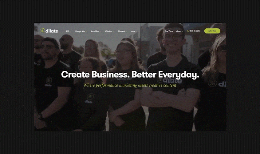
By Tanya Dharmapala
If your website is your showroom, then web design is your visual merchandiser. Just as merchandisers transform physical stores into irresistible shopping experiences, web designers turn your website into a curated user experience that not only attracts browsers but keeps them on your page and converts them into buyers.
But, much like the latest smartphone or popular streaming show, the digital landscape is constantly evolving. Website designs come in and out of fashion constantly. One minute, flat, minimalist sites are all the rage and the next, it’s bold colours, video backgrounds and 3D animation.
So, how do you figure out what's sticking around and how to stay ahead? We've got your back! We've analysed the hottest design techniques that are serving looks in 2024 and compiled this list of 20 top trends to get you inspired.
1. Make things pop with Claymorphism
Claymorphism is the new age of 3D effects. Using dual inner drop shadows and an outer shadow to create this really cool, soothing floating aesthetic that's super subtle. It's a really inviting way of making key visual elements pop without overdoing it.
The only thing you have to be careful with is using it too much through your site– this can give it a really childish vibe if you're going overboard on all of your elements and typography. Unless that's your target audience, in which case, go for it!
Use cases:
- Helping call-to-action buttons stand out
- Making elements that can be selected or toggled more obvious
- Breaking up card elements
2. Find your inner Marie Kondo with Minimalism
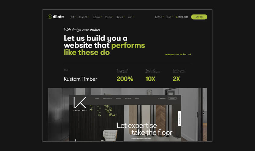
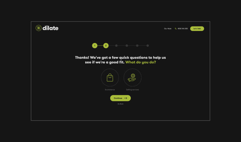
Kustom Timber, website by Dilate
Minimalism has been around for a while, and the clean, inviting look isn't going anywhere.
Minimalism on the web focuses on strictly keeping only the info and elements that matter most. It’s all about amplified user experience through simplicity.
Some tell-tale signs of minimalist sites include:
- Lots of white space instead of crowded text or images
- Sans serif fonts and stripped-down layouts
- Visual hierarchy guiding visitors to key actions
- No fancy flourishes or garnishes here!
More folks crave a simple, low-stress browsing sesh. Minimalist sites promise just that through a ruthless focus on site visitors' needs.
3. Get jiggy with Asymmetrical Layouts
Alright, it's time to break free from tradition. Set aside those even-sized boxes and embrace a more dynamic and unpredictable approach, using overlapping elements, non-linear arrangements, and unexpected placements to create visually striking and engaging websites.
We're not saying "be messy", but allow your design elements a bit more freedom to find their own space and showcase your brand personality.
Asymmetry can also help draw attention to specific elements and create a more memorable and unique user experience, making it a powerful tool for brands looking to stand out in the digital space. sides or top, footer at the bottom.
4. Maximise delight with Micro-interactions
Don’t let the jargony name throw you. Micro interactions are just little touches on websites that surprise and delight visitors. We’re talking subtle animations, clever reactions, and responsive details that make you go “Ooh!”. Things that tell people they're doing the right thing.
Here are a few primo examples:
- Icons that animate for a second when you hover over them
- A “Like” counter ticks up right after you click
- Subtle changes to a button on hover that entice users to click
- Playful transitions between pages or sections
These micro interactions and fluid motion designs aim to glue eyeballs to your site longer.
So consider packing your website design with little interactive pick-me-ups! Surprising website visitors with responsiveness makes browsing feel like playing. Just be careful of the time loading animations can add to the site, and make sure you design to be responsive.
5. Embrace the Dark Side (Mode)
What’s sleek, moody, and darn easy on the eyes? Dark mode, baby! This trend has been gathering steam for years and will continue darker than ever. We’re talking about inky black backgrounds, darkened interface elements, and greyed-out accents. You might be able to tell we're big fans at Dilate.
Enjoy these brooding traits:
- Mostly dark greys and black backgrounds
- Lower brightness colour palettes
- High contrast for easy reading
Dark mode gets extra attraction for its slick, modern vibe. And it pulls users to key lush-coloured content and elements that sit against the moody yet comfy UI.
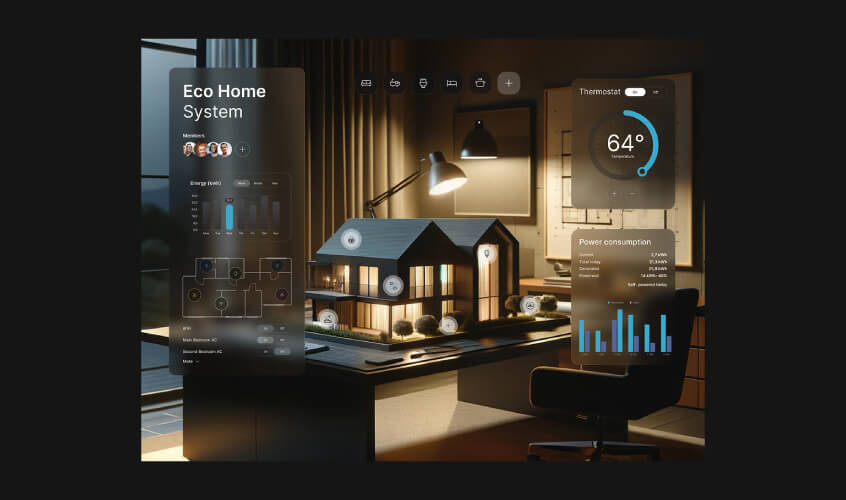
6. Get multi-dimensional with modern 3D Elements
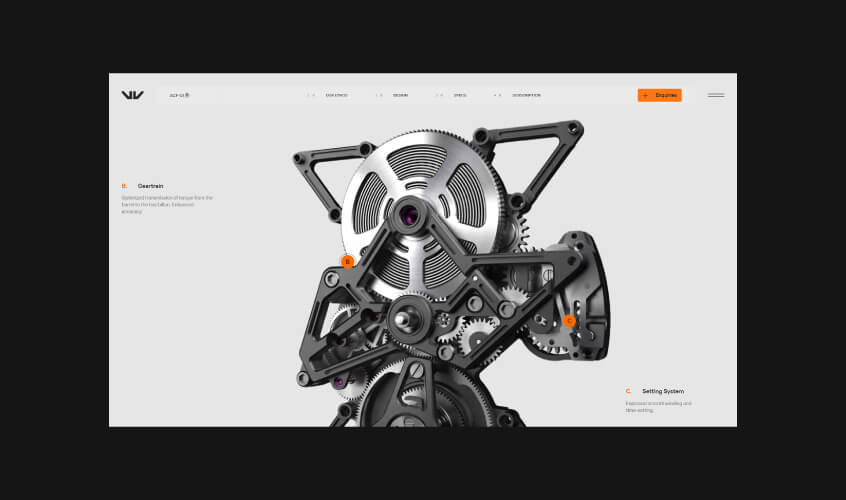
Remember that old-school 3D everyone was crazy about in the early 2000s? Well, it didn't really go away, it just got a lot prettier.
New tools have helped 3D modelling and animation get way more realistic. We’re talking about detailed, high-quality 3D elements blending right into site designs. Sharp shadows, lifelike textures, smooth motions that impress rather than distract.
Pump up the visual volume with seriously elevated new-age 3D models– perfect for showing off products, bringing life to designs, and driving user engagement.
7. Get interactive with AR (Augmented Reality)
Remember Pokemon Go turning the whole world into a video game playground? Well, that "augmented reality" magic is hitting websites too for some truly trippy effects!
AR lets you overlay computer graphics onto the real world through a screen - think Snapchat filters on steroids. Now, cutting-edge sites are integrating wild AR features for next-level interactivity. Like digitally trying on makeup, seeing 3D products spun around or even placing them in your own home.
It's a great way to connect real-life experiences with the virtual world of your website. And especially great for eCommerce websites looking to improve online experiences for site visitors who want a real-world shopping feel.
8. Speed up your site Smart Loading
Quick quiz—what's more boring than watching paint dry? Waiting for a slow site to load, bam!
New clever coding techniques like infinite scroll and lazy loading only grab site content as you need it– instead of coughing up a hairball of heavy images, videos and plugins right away. This keeps the initial load snappy, and THEN it serves extras seamlessly as you scroll.
Signs of sped-up load times include:
- Loading bars on clickable sections
- Just-in-time media popping in
- Auto-grabbing more content infinitely
In an "I want it now" world with no patience left, smart loading is mandatory. Sitting and staring at circle icons for 30 seconds will have users instantly abandon your site. So remember to plan content delivery based on visitor behaviour for blazing-fast experiences and reduced bounce rates.
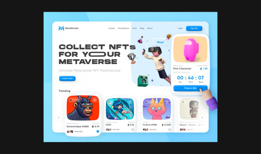
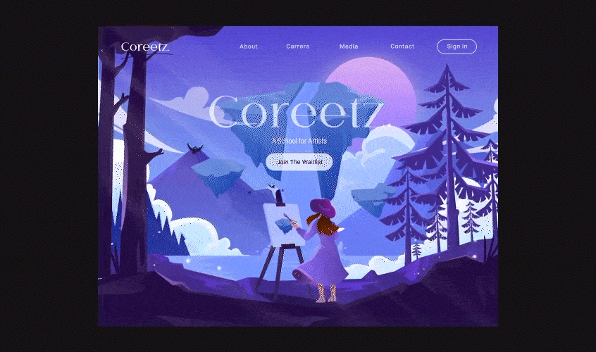
9. Stand out with Bespoke Illustrations
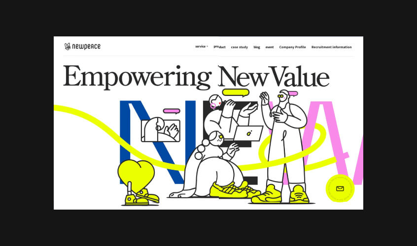
Alright, quick - what pops into your mind when you hear “stock images”? Cheesy grins, bad acting, generalised imagery? Ya, we’re over it too. 2024 is all about custom graphics with personality!
We’re talking quirky hand-drawn sketches, one-of-a-kind graphic art, and other images created just for YOU. Fitting seamlessly into your site with charm instead of that deja vu vibe.
Signs of custom illustrations:
- Handmade imperfections
- Matching colour schemes
- Communicating branding
- Oriented around product/service
When stock images all start looking the same, personalisation pops. Handmade illustrations aligned to your offerings give readers something delightful and distinct to latch onto. Whether it's your hero image, helpful data visualisation graphics or feature images for blogs– there are so many ways to incorporate these. They're also a great way of making a point and explaining tough concepts.
10. Drive conversations with friendly AI Assistants (Chatbots)
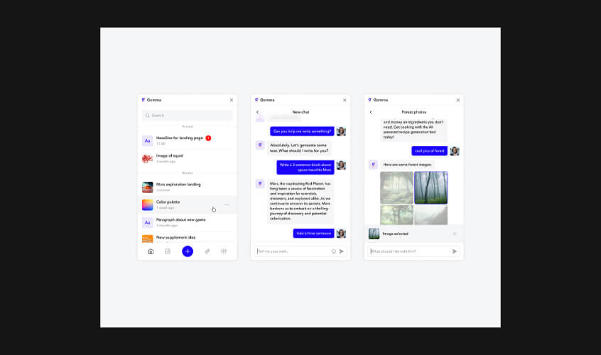
"How can I help you today?" Don't be surprised if this friendly question pops up on sites more often from animated chatbots rather than humans! AI assistants are taking over for fast, free-flowing customer communication.
Chatbots can respond to common questions, guide purchases, book services and more. And they chat in real-time 24/7 for an instant personalised connection that many customers dig.
Typical bot abilities include:
- Answering FAQs
- Recommending products
- Appointment booking
- Processing payments
As life gets busier, immediately accessing assistance - without hold times or email tennis - is essential.
11. Move the scroll bar with Scrolling Animations
Scrolling animations transform the simple action of moving down a webpage into an interactive storytelling journey. As users scroll, various elements slide, fade, grow, colour, light up or even dance into view, creating a dynamic experience that can guide them through the site's content in a visually engaging way.
This trend not only captivates the audience but also provides designers with a creative avenue to highlight key information, maintain user interest, and subtly encourage visitors to continue exploring.
By integrating motion with scroll, websites become more than just static information hubs; they turn into immersive storytelling experiences where each scroll reveals a new chapter, making the user's journey both intuitive and memorable.
12. Get spacey with Spatial Design
Spatial design focuses on user engagement, designing a user interface that let's them customise the space they're playing in. It's a visually appealing style with interactive elements that allow users to expand, move, or close elements.
It usually features this glassy or translucent overlay, but the main focus is on organising the space to create the best user experience. It ties together a lot of real-life design principles pulling from fields like architecture and interior design and combines them with exciting new virtual reality and digital product design principles. Deliver all new kinds of immersive experiences that get users to play on your site.
13. Embrace the future with Blockchain Integration
It sounds complex, yet we're talking about simple security integrations like login credentials or transactions stored on distributed ledgers.
For users, this decentralised data storage means beefed-up security, ownership of personal info, and transparent transactions. One feature that's increasing in popularity is the option to pay with cryptocurrency.
User data scandals and institutional distrust mean people want more control over their information. Thus, blockchain offers websites a huge trust boost for visitors who want sites to respect privacy.
14. Reward users with dopamine from Gamified Design
Gamified design is like turning parts of a website or app into a mini-game, where you get points, badges, or even top spots on a leaderboard for doing things you'd do anyway.
See how you can incorporate interactive content like:
- Quizzes
- Polls
- Calculators
- Appointment booking tools
It’s all about making the user experience more engaging by giving visitors little wins for interacting with the site. Who knew clicking around could feel like a victory lap? This trend hooks into that awesome feeling of achievement and keeps people coming back for more, making every click a bit more exciting.
It's also a great way to increase conversions if you gate certain elements (especially after they're already engaged in the interactive content).
15. Put the focus on the words with Text-Only Hero Images
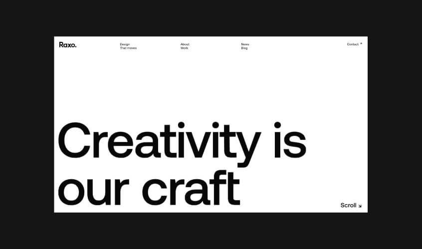
Picture this: you land on a webpage, and instead of the usual big, flashy photo at the top, you're greeted with a bold, beautifully crafted message that grabs your attention. It's like walking into a room and having someone tell you a compelling story instead of showing you a photo album.
This approach strips down the distraction, putting the spotlight on a powerful phrase or statement that sets the tone for the whole site. It's a minimalist's dream, proving that sometimes, less really is more.
Plus, it's a great way to make a memorable impact with just a few carefully chosen words. Who knew a handful of words could pack such a punch?
16. Cater to everyone with Accessible Design
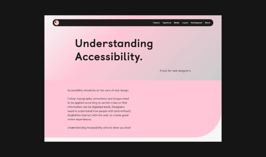
Accessible design is like opening your digital doors wide open and saying, “Everyone’s welcome here!”
It’s all about making your digital interfaces easy to use for as many people as possible, including those with disabilities. Think big, clear fonts, easy-to-read colour contrasts, and voice commands for those who can’t use a mouse or touch screen.
By focusing on accessibility guidelines in the design process, you're not just checking a box for inclusivity; you're crafting experiences that truly resonate with everyone.
17. Keep them moving with Parallax Scrolling
Parallax scrolling is like adding a little magic to your webpage scroll—elements move at different speeds, creating an awesome depth effect that's a bit like watching a cool 3D movie.
As you scroll down, the background moves a bit slower than the content in front, making everything feel more dynamic and alive. It's like when you're driving and the trees close by zoom past, but the mountains in the distance seem to move slowly. This nifty trick keeps users engaged, turning a simple scroll through your site into an interactive adventure.
Plus, it's a great way to tell a story or highlight important bits in a fun and engaging way. So, keep them scrolling and keep them wowed with parallax magic!
18. Bring custom graphics to life with Micro Animations
You thought bespoke illustrations were cool? Imagine if they moved!
Little animations that greet you when you do something right, like a thumbs-up when you complete a task, or icons that dance a little jig when you hover over them. It’s those tiny details that bring a smile to your face and make the experience feel personal and alive.
It's like your website is giving your site visitors little high-fives as they go along, making everything they do feel a bit more rewarding. So, whether it’s a button that lights up when they click on it or a menu that unfolds in a cool way, these little bits of motion add up to a big impact, keeping things lively and engaging.
19. Put the spotlight on brand awareness with Embedded Videos
Embedded videos are like having a mini TV on your page, ready to show off your message in full-colour, action-packed glory. It’s a direct ticket to grabbing your visitors' attention without making them work for it—just hit play and dive into your brand story.
Whether it’s explaining how your product works, showcasing customer testimonials or just setting the mood, videos bring your content to life in a way that text and images alone can’t match.
It’s like saying, “Hey, take a break from reading and watch this cool clip!” Plus, it’s a great way to keep visitors on your page longer, soaking up your message with popcorn in hand. Who doesn’t love a good video, right?
20. Soothe the soul with Responsive Web Design
Responsive web design makes your website look awesome on any device, whether it's a giant desktop screen, a laptop, a tablet, or a smartphone.
It's all about making sure your site adjusts its layout, images, and menus to fit beautifully and function flawlessly, no matter the screen size. Imagine opening a site on your phone and everything just flows into place, easy to read and navigate without zooming in and out like you're trying to crack a safe.
It’s like your website knows exactly what device you’re using and rearranges itself to give you the best viewing experience. In a world where we switch from screen to screen, responsive design keeps your site user-friendly and accessible to everyone, anytime, anywhere.
It's also incredibly important if you care about search rankings and search engines, as Google favours user experiences, especially on mobile view more and more.
Looking ahead to 2024 web design trends
And that wraps up our whirlwind tour of 2024's top web design trends!
It's clear that the digital world is buzzing with innovative ways to engage, delight, and communicate with users from the design process to how you curate web content. Remember, the key to staying ahead isn't just about adopting every new trend; it's about understanding your audience and selecting the elements that resonate most with them.
Of course, implementing sophisticated web designs like these requires serious skill. That’s where partnering with a professional web design company pays dividends. An expert web design services provider can craft stunning sites with cutting-edge experiences that align with the latest trends.
That's where we come in.
Ready to realise your web design dreams? Contact our exceptional web design team anytime to chat about renovating your online home!


